Research
Blog #6: Visual
We
will discuss how to develop and post images during the class session, and you
are welcome to post it then. Show us at
least one visual graphic that can illustrate your project. Describe the visual and explain its
significance. This can be an image found online, a graph that you have prepared
in PowerPoint, or any other visual aid that can help other people understand
your project. Ideally, this should be a
visual aid you might include in your oral presentation. You are welcome to include it with the final
paper as well, if appropriate.
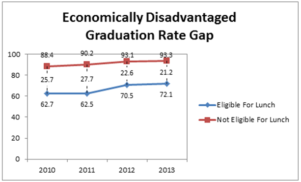
I
decided to choose this graph as my visual to represent a large from in our
country. The academic graduation rate has started to become a large problem
amongst those students from poor backgrounds while those who are from wealthier
backgrounds belong to the percentage of students whose graduation rate has
steadily increased. As you can tell by the visual diagram, the more wealthier the
family the more likely the student graduates in four or five years.
No comments:
Post a Comment